Color Palettes That Work Well on Camera
Choosing the right colors for your photo shoot isn’t just about fashion—it’s about creating visual harmony, enhancing your features, and making sure your images pop. Whether you're prepping for a branding session, engagement shoot, or family portraits, the colors you wear play a huge role in how your photos turn out.
Let’s break down the most camera-friendly color palettes and how to use them to your advantage.
Earthy Neutrals: Timeless & Versatile
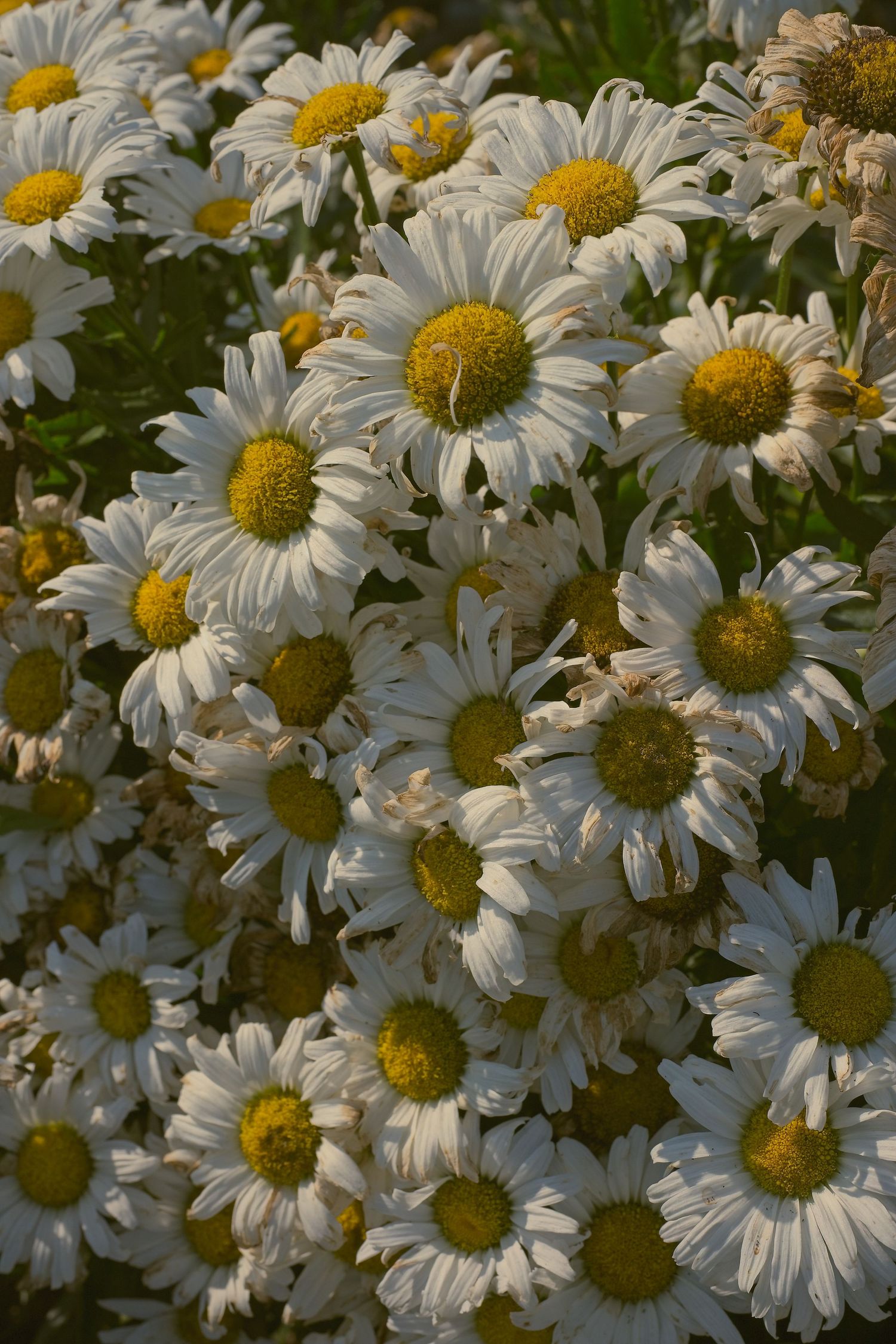
Colors: Beige, taupe, olive, rust, cream
These tones are universally flattering and create a warm, organic feel. They work beautifully in outdoor settings and pair well with natural backdrops like fields, forests, or beaches.
Best for: Lifestyle shoots, family portraits, BoHo vibes
Soft Pastels: Light & Romantic
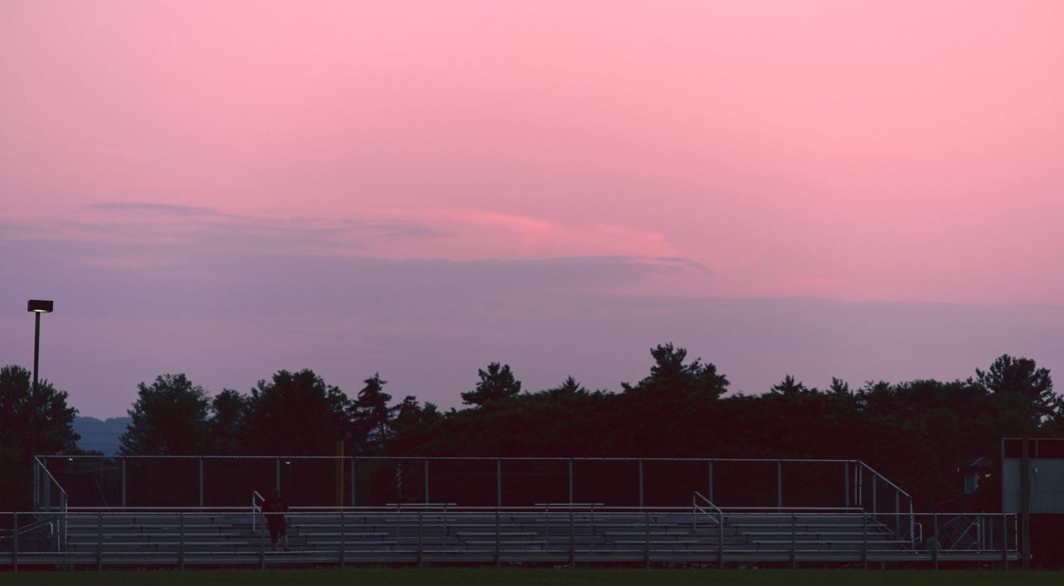
Colors: Blush pink, powder blue, mint, lavender
Pastels add a gentle softness to your look and photograph beautifully in natural light. They’re especially great for spring sessions or dreamy, romantic themes.
Best for: Engagement shoots, maternity sessions, spring photos
Jewel Tones: Bold & Elegant
Colors: Emerald, sapphire, ruby, amethyst
These rich hues add depth and drama to your photos. Jewel tones stand out without being overpowering and look stunning against neutral or dark backgrounds.
Best for: Studio portraits, formal branding, evening shoots
Monochromatic Layers: Sleek & Cohesive
Colors: Variations of the same hue (e.g., navy, denim, sky blue)
Wearing different shades of the same color creates a clean, modern look. It adds dimension while keeping the outfit visually unified.
Best for:Personal branding, editorial shoots, minimalist aesthetics
Complementary Combos: High Contrast, High Impact
Colors: Blue + orange, red + green, purple + yellow
These color wheel opposites create vibrant contrast and energy. Use one as the dominant color and the other as an accent to avoid clashing.
Best for: Creative shoots, fashion editorials, bold branding
Analogous Harmony: Smooth & Balanced
Colors: Colors next to each other on the wheel (e.g., blue + teal + green)
Analogous palettes offer a subtle gradient effect that’s pleasing to the eye. They’re great for group shoots where coordination matters.
Best for: Family sessions, team branding, lifestyle shoots
What to Avoid
Neon colors: They tend to reflect light harshly and can distort skin tones.
Busy patterns: These can distract from your face and create visual noise.
Logos or text-heavy clothing:They date the photo and pull focus from the subject.
The best color palette is one that complements your skin tone, fits the shoot’s theme, and makes you feel confident. If you're unsure, ask for guidance and I will help you figure out what works best with the location, lighting, and mood you're going for.